Motorsports in Black and White lV

When it comes to a black and white motorsports image, this is as close to perfect as you can get. What little background distraction there is has been blurred out by the slow shatter speed panning.

Overview

In this fourth installment of our series on motorsports in black and white, we will focus more on tools and techniques. While some photographers may not know, many of us can look at an image and know how, and what tools were used to process the image. From the person who just clicks the convert to black and white button, to those who put some serious work into adjusting contrast, highlights and shadows, and a few extra touches in an effort to make the image something special. When I use to pour over racings mags in my youth, there was one constant. The best photos were in color on the covers, or the in the center. All others were in black and white. This was mainly due to the cost of publishing in color. Color film has been readily available to consumers since the early 30s, but of course the cost was higher than black and white. So you would have to have a reason to justify the cost. Today there is only a small niche market of photographers who shoot primarily in black and white, weather it be film or digital. For me and the subjects I shoot it constitutes more of an art form. In the world of motorsports photography, many, or should I say most shots do not lend themselves well to good black and white images.

Most distractions in this image have been pushed far into the background by selective use of contrast adjustments

Subject

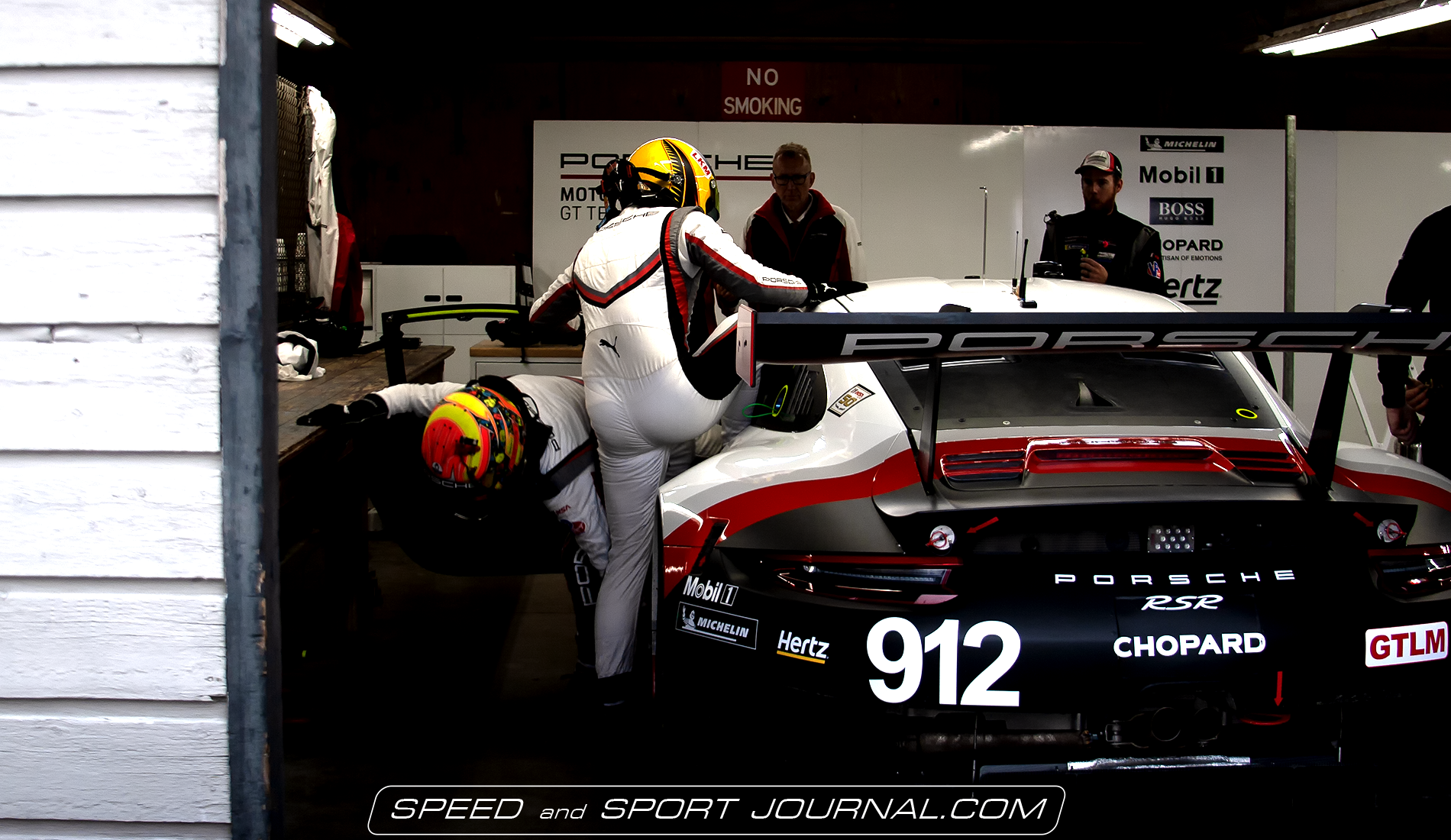
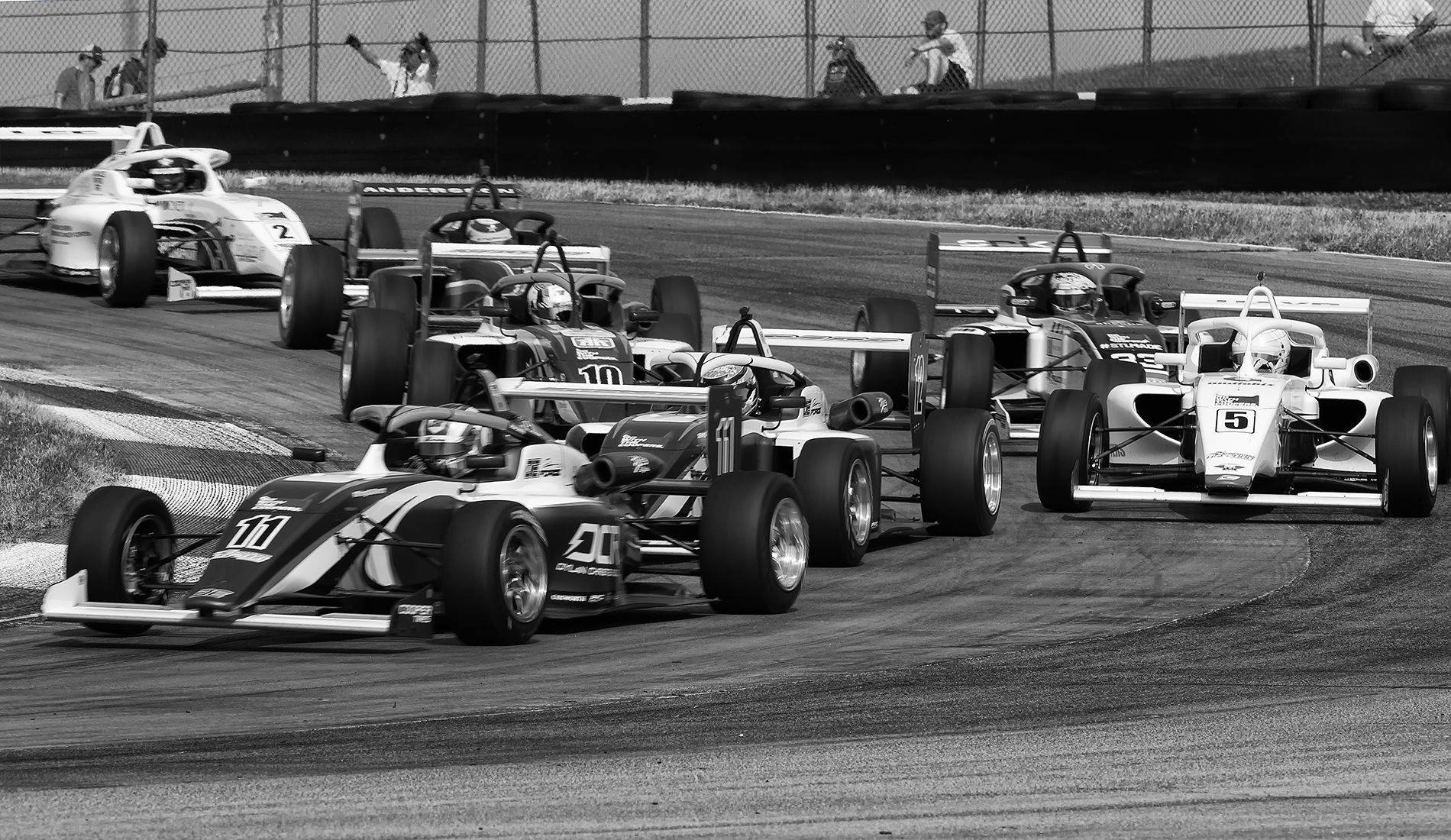
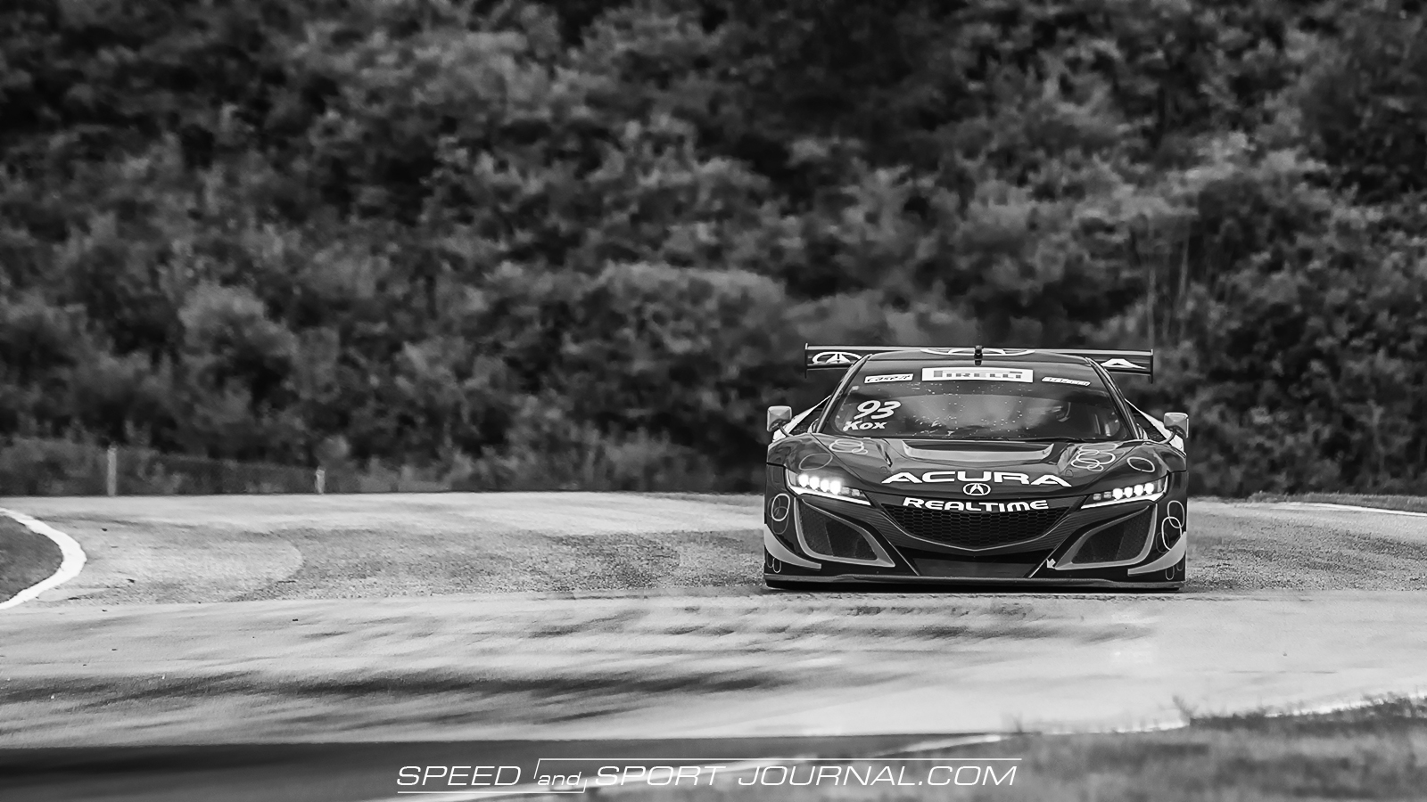
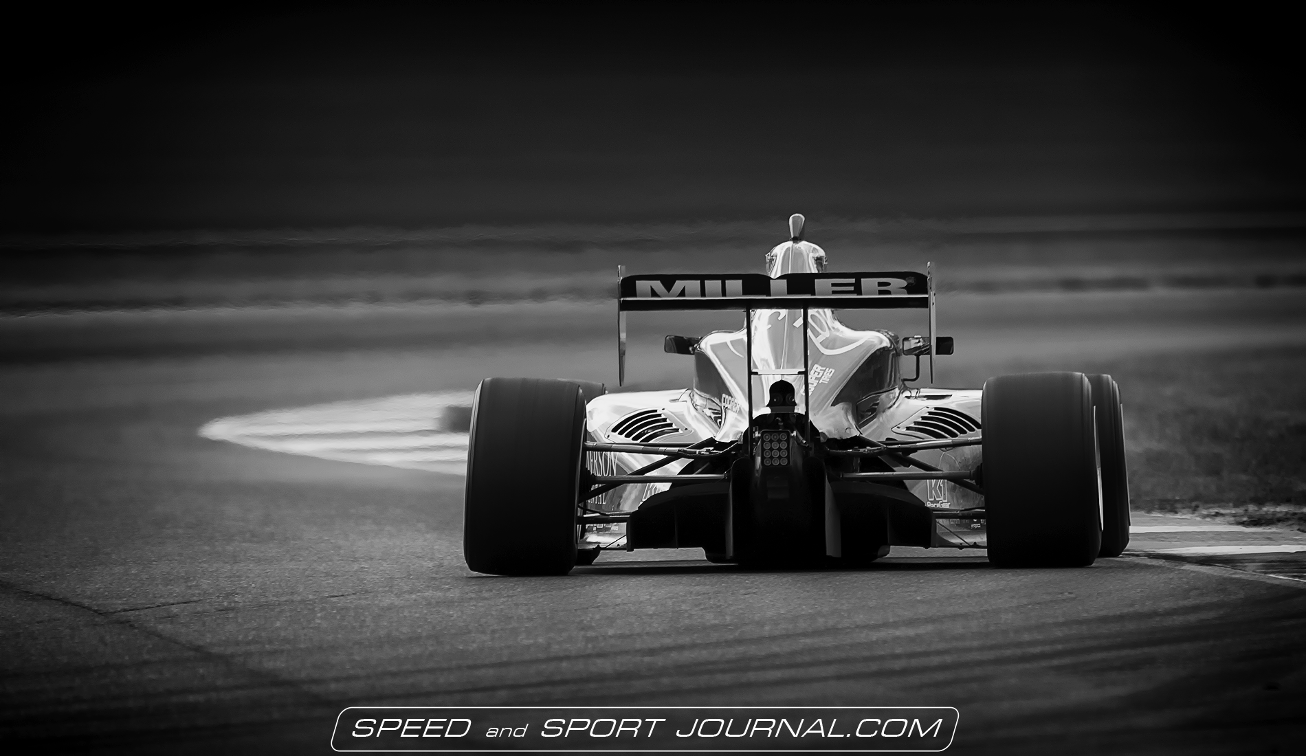
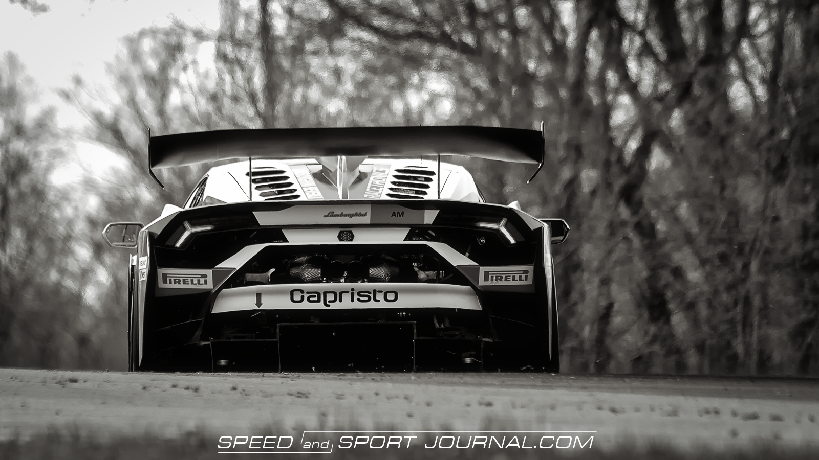
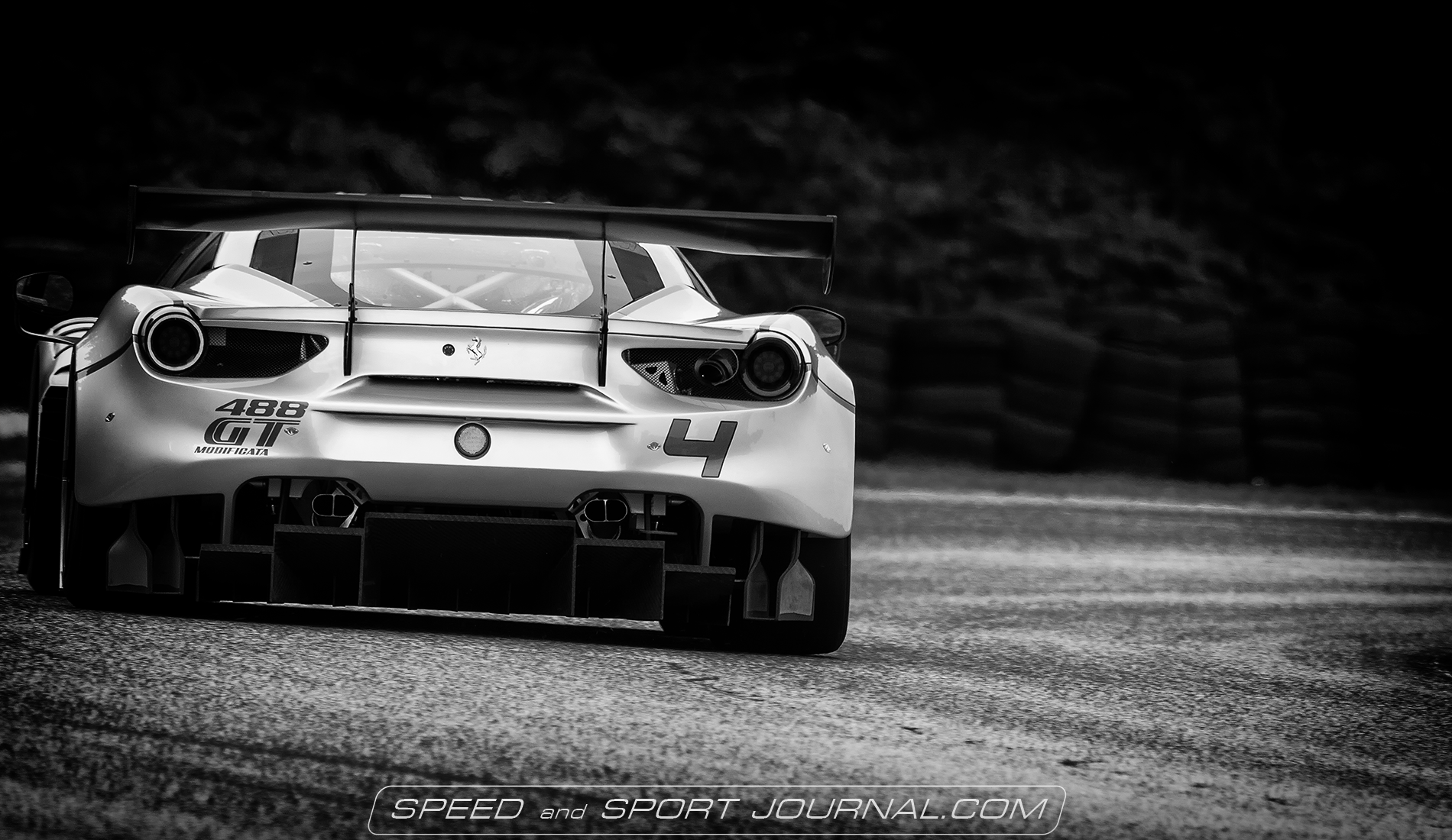
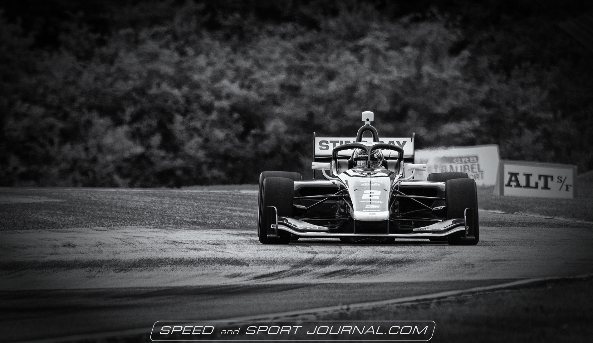
Choosing the right subject for black and white processing is the first critical step. My first criteria is a background that is as distraction free as possible. Fences, grandstands, people, and large groups of cars should be avoided. The vehicles color is also an important element. Some colors are harder to work with in black and white. I’m not saying it can’t be done, it is just more work. If you can also avoid images with large areas of shadow such as front air intakes, or rear diffusers. These areas can be corrected, but again you will have to do more work.

Trees are one of the appealing background elements that lends it self well to black and white

Tools

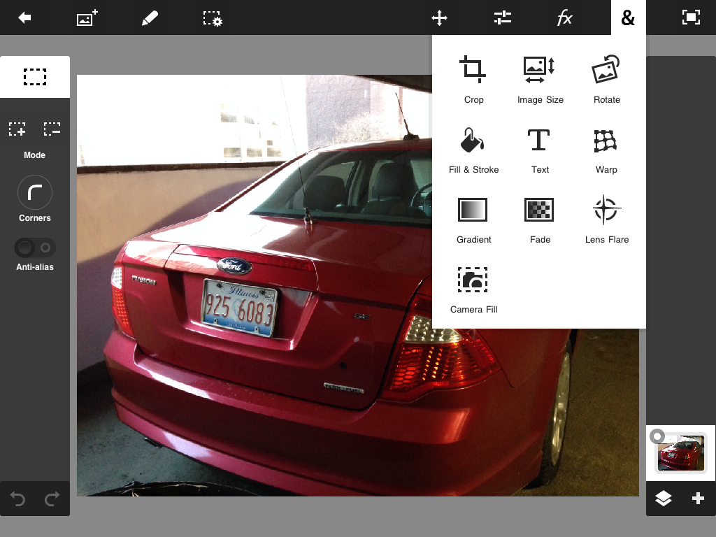
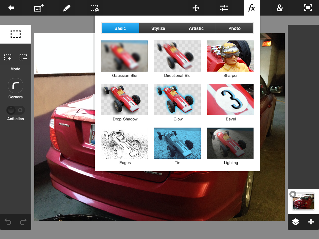
Even the most bare bones image editor can create black and white conversions. Some of the more common ways offered are a convert to black and white button, which will essentially remove all color from your image. Other ways of accomplishing the task are desaturation, or a channel mixer tool with sliders to remove colors. The channel mixer when used properly can produce satisfactory results when combined with some of the other tools built into most editors. Another option is to purchase a third party package with more advanced and sophisticated conversion tools. I have used a few of these, and have found in my opinion DX O’s Silver Effects to be superior to anything else I have uses. It is just one module in the NIK filters bundle. I use about half of the nodules in this package on a regular basis, but if Silver Effects were the only one I used, I would still buy the package just for it alone. The key to any conversion software whether basic or advanced is to take the time to learn how to use them effectively.

There is something special about catching a vintage race car just right for black and white. It looks natural.

Theory

The most important part of understanding black and white photography, is understanding the single basic element of photography itself. Light and Shadow. For all the talk of film vs digital, 6 vs 60 megapixels, and DSLR vs Mirrorless, it comes down to one simple inescapable factor, all cameras do the same thing. Capture light. How it does it, in what way shape or form is just a matter of the choice of the photographer. However understanding the relationship between light and shadow is what will make the biggest impact on your photography. The camera is just a tool.

Joel

Unpublished #1

Every photographer I know has them, lots of them. Images that were taken at an event but were never posted or published anywhere. If you are like me, many have never even been edited. So when I am going through archived folders and run across one or more I think are worthy of publication, I copy them to a folder named hold for processing. Then from time to time when I am looking for something to post online, I go to this folder first. Most times I find what I need there. With that said I am going to start a new recurring series titled Unpublished to highlight some of these images, so they can finally see the light of day.

I have taken many shots go this Jaguar, but none that I thought were more than just average and not worth doing anything with. But somehow I miss this one.

This is one of my more unique images, but if you are going to shoot driver change practice, get permission first as I did. A guy who came along after while I was reviewing my shots did not asked. He learned a few new German swear words.

Here we have an interior of one of Blackdog racing’s McLaren’s shot in the first year of them operating them.

Joel

Motorsports in Black and White lll

While not the ultimate, I consider this image a good subject for black and white because it has only one distracting element in the background.

Once again we revisit one of my favorite subjects, Motorsports in black and white. His time we will look at subject matter. Which of the photos you have taken will look compelling in black and white. When you look at black and white photos of the past, shot by some of the greatest photographers such as Ansel Adams, Gordon Parks, and Walker Evans, you can’t help but think that the subject matter seems to have been made for the medium in which it was shot. After all color film had been around for some time, and these photographers could well have afforded to use it if they were so inclined.

Landscape, portrait, and street photography are some mediums that benefit most from black and white. Motorsports is quite a different matter. Just any old shot shot from anywhere trackside will not translate well into black and white.

As much as I like this image, the fence in the background is just a bit too much for my taste.

When I go through shots from an event, I look for certain criteria to determine if I can produce a compelling black and white image with it. The first, and most important is how many, or few distracting elements are in the foreground, but mostly in the background. Second, is it a dynamic shot that will draw peoples attention. Or will it just look like a car on a track. Third is the color, and livery on the car or bike. Wild multicolor liveries will just turn into a mess leaving the viewers eye wandering looking for a focal point which they will likely not find. So I tend to avoid these. Every so often I will look at a shot on the the cameras screen and know right away that I will convert it to black and white.

Here we have an image that I would never consider for black and white because there is just too much going on both on the track and in the background.

As with most things about photography, it’s all up to the eye, and taste of the person who presses the shutter. I can only offer my own personal views and options.

Joel

Motorsports in Black and White ll

Black and White motorsports photography while once the norm is now a speciality form of photography. Many try it, few do it well. In this day and age fo high megapixel color photography, black and white gets relegated to a seldom used, or just lost art form.

When considering wether too process a photo for black and white, the first thing you have to understand is that not every shot will look good in this medium. Shots with busy and distracting backgrounds will not work. Next you have to consider the subject matter. Dark blue, green, and black cars or bikes are likely to lose a lot of detail in conversion, and just look like a badly underexposed image. Packs of multiple vehicles close together will leave the viewers eye wandering trying to find the main subject of the shot.

When going through your work, look for shots with one or two subjects isolated on a relatively clear background. This will take the viewers eye directly to the main subject. From there they can explore the rest of the image. If the background is slightly blurred, that makes it even better. Overcast and rainy days also lend themselves well to black and white. All in all you should choose your subject matter carefully.

As for tools, any image editor will give you good results as long as you take the time to learn what you can do with the tools at hand. Spend some time experimenting with sliders and filters to squeeze the most you can out of your software. Just selecting convert to black and white from a preset menu will give you mediocre results at best. I’m partial to NIK Filters Silver Effects for black and white conversion. There are several other stand alone, or plug in programs out there, but this is my personal favorite. So all that is left to do is jump into the deep end, and see what you can create.

Article inspired by Kurt Roussell @ Fast Car Photos.

Joel

MotorSports in Black and White

Black and white photography in motor sports seems to have always been a matter of necessity more than choice. At the origins of auto racing it was pretty much all there was. Photography and racing are two technologies that grew up side by side. In later years as color film became more prevalent, and less expensive, it was only natural that many photographers would take advantage of it. But in being able to present it to the public at large there was yet another more important hurdle to overcome, printing.

To bring the news and action of racing to the interested masses required the ability to write the story as well as publish photos from the events. At the time auto racing began, it had not been that long since the ability to print photos in magazines and newspapers had been invented. Half toning, a process of using dots of ink of varying size and intensity to form a picture, had only been developed in the 1890s. This allowed publications to use actual photos instead of illustrations to present the news. When it came to sports, and auto racing in particular, the only other limiting factor of the day was the camera equipment available at the time.

Large box shaped cameras of the earliest days required a tripod, and a very brave soul willing to stand mere inches from speeding cars to capture the action. What we are able to do today (and from farther away) with our digital cameras, and 500mm lenses would probably seem like alchemy to someone from the 30s wielding a Graflex Speed Graphic with a fixed focal length lens.

In today’s world, black and white photography in motorsports is a very much overlooked tool of the trade. When you look at old racing publications of the 50s through the mid 80s you will notice that only the cover, and a few center pages are in color. This was mainly due to the printing cost as well keeping the publication’s need to keep the magazine at a reasonable price. So most of the ordinary shots were relegated to the black and white pages. Those thought to be the best were given the color pages.

Today we have the luxury of choosing the shots that are best suited to black and white. We have the ability to make exposure and lighting adjustments to enhance the image and mood we are trying to convey. What we can do in a few hours of post production on a computer, would have taken days with chemicals in a darkroom. Thus we get to use it more as an art form. While this was the intent of all photography at one point, the demands of the commercial world soon beat that out of us. While black and white in motor sports is largely overlooked, when it is used, it is often done with mediocre to abysmal results. Mostly because the photographer doesn’t take time to learn the tools they have at hand, and many don’t take time to determine whether the shot is well suited to to the medium. When done correctly, the results can be quite stunning. Tools such as levels, curves, dodging and burning can go a long way toward adding contrast, and breathing life into what may otherwise be a flat image.

Landscape and portrait photographers were among the first to fully understand the power of black and white photography. Color film became available in 1904, yet many chose to stay with black and white. Looking at the work of Ansel Adams, Walker Evans and Gordon Parks and trying to imagine them in color yields disappointing results. I’m sure they understood that the very essence of photography was the difference between light and shadow, and color could not adequately portray this.

So what’s a photographer to do? My solution is to make a cup of coffee, find a comfortable place to sit, and re-read one of my books on the basics of photography. Not digital, or film, just photographic technique. This normally resets my brain, and makes me think a bit more before I shoot.

Joel

Review: Photoshop Touch

I quite often tell people one of the most useful pieces of tech I have purchased recently is my iPad. When I first received it I knew it would be useful, but I had no idea just how useful. Being a photographer, my first thoughts are how can I use this in conjunction with my photo work. This is no easy task as mobile devices were primarily designed to work with photos from their built in cameras. Getting images from a DSLR into these devices is not particulary easy or intuitive. Which brings us to the subject at hand.

A quick trip to the App Store, or Google Play you will find a ton of photo related apps. As far as photo editors, most are minimal to to just plain awful. Most new ones seem to focus on hokey filters that make your photos look like those in a shoe box on the closet shelf. You know, the ones you never look at because they look so bad. There are a few quality photo editing apps out there, but the one we are concerned with here is from the big daddy of photo editing software.

2014-01-08 19.15.28
Image 1 – Main Interface

When I first came across Adobe Photoshop Touch, the first thing that stood out was the price $9.99. As apps go this is kind of expensive. As Adobe goes, this is kind of cheap. Well I took the plunge anyway and downloaded it. It has only been recently that I have had a chance to really delve into it’s capabilities. When you first launch the app your first reaction is “huh”. The main interface (image 1) is like nothing you have ever seen in an image editor, least of all from any Adobe product. With the usual lack of documentation, it is up to you to click, poke, drag, and whatever else it takes to learn your way around it. The Adobe web site does have some tutorial videos that will give you an idea of the apps full power. Besides the menus and tools covered below, there is full layers support, and some new and clever selection tools designed specifically for touch screen devices. The 3D layer view which shows exactly how you layers are positioned in your document is very cool.

2014-01-08 19.17.46
Image 2 – Tools Menu

Once you get use to the menus being just icons, and unfamiliar ones at that, you will be as surprised as I was just how much real editing power is built into this app. I am one of Adobe’s biggest fans, and biggest critics, but I have to give it to them on this one. This is the only really serious image editor I could find for mobile devices.

What would normally be your Tools pallet can be found in the menu represented by the & symbol (image 2). Selection, Fill, Text, Gradient and a few others can be found there. My first issue was finding the tools I normally use when editing images. The icon that looks like two sliders (image 3) is where most of your key adjustment tools are found. All of the important tools are there. Levels, Hue & Saturation, Black & White, and most surprisingly Curves.

2014-01-08 19.15.51
Image 3 – Adjustment Menu

The FX menu (image 4) is in four sections, and contains the usual suspects. The sections are, Basic, Stylize, Artistic, and Photo effects. Oddly enough the Sharpening tool is in the basic section of the FX menu. To me it would seem more at home in the adjustment menu.

2014-01-19 12.29.16
Image – 4 Effects Menu

I have only one serious gripe about the app, but for me it’s a big one. The Crop tool is pretty strait forward as it goes. Most people crop images by just dragging until they have the selection they want. For me I crop to a specific size for images posted to online sources. while you can enter a set size into the crop tools dialogue box, when you drag the corners to make crop fit your selection the dimensions increase. Thereby negating your entry in the dialogue box. Trying to enter the dimensions into the image size dialogue only distorts the image. As my primary use for the app will be online posting while on the road this is a considerable problem.

Overall this is a remarkable app, with just about every tool you will need for serious image editing on the go. Once you become comfortable with the interface, your only real problem will be getting images into it or your mobile device. You can take photos from within the app using your devices camera, but most other work arounds will require an investment.

Photoshop Touch is available for IOS and Android tablets and phones. The more frugal among you might have a problem with having to pay twice to have it on both devices. The tablet version is $9.99, while the phone version is $4.99. They are not interchangeable, you have buy it separate for each device.


Scroll to top